Apryse

Xodo Document Management

My Role
Senior Product Designer
Timeline
Dec 2022 - Jun 2023

One-Stop Solution for Viewing, Annotating, and Working with PDFs

Led a major UX initiative to modernize Xodo, shifting away from a basic tool-based interface toward a cohesive, modern application. The project aligned with a broader company rebrand and focused on improving usability, feature discoverability, and visual consistency.

1. Project Overview


My Role:

Senior Product Designer – led user research, competitive analysis, UX strategy, wireframes, high-fidelity prototypes, and cross-functional collaboration.

Deliverables:
  • Customer surveys and interviews
  • Competitive analysis
  • Wireframes
  • High-fidelity Figma prototypes for JIRA tickets
Outcomes:

This project resulted in a complete refresh of Xodo's homepage, designed to improve usability, increase tool discoverability, and support the new Apryse brand identity. The redesign introduced features like a tool favoriting system, global search, and a more modern navigation model (laying the groundwork for a more scalable and intuitive product).

These improvements helped position Xodo as more than just a PDF editor, reframing it as a robust, user-first platform for document interaction across web, mobile, and desktop. Xodo saw a 2× increase in monthly active users, reaching over 2 million MAU.

2. Understanding the Problem


Legacy User Experience

While Xodo had strong technology under the hood, its user experience lagged behind. The homepage, in particular, functioned more like a utility menu than an application dashboard, making it hard for users to find tools quickly or understand what Xodo could do beyond basic editing.

Rebrand-Driven Design Overhaul

In early 2023, Xodo’s parent company rebranded from PDFTron to Apryse, triggering a complete UI/UX overhaul across all products. The challenge was not just to reskin the interface, but to align the entire product experience with the new brand’s values: clarity, consistency, and ease of use.

3. Process

To inform the redesign and uncover user needs:

  • I conducted surveys and interviews with Xodo users to understand workflows and frustrations
  • Benchmarked competing tools to understand industry standards and emerging trends
  • Collaborated with product managers and engineers to scope features based on business goals and technical feasibility
  • Created wireframes and interactive prototypes in Figma, iterating based on internal feedback and usability reviews

This process ensured the new design was rooted in real user needs, not just visual polish.

4. The Solution

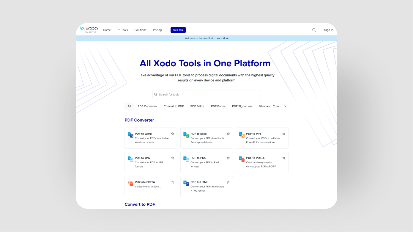
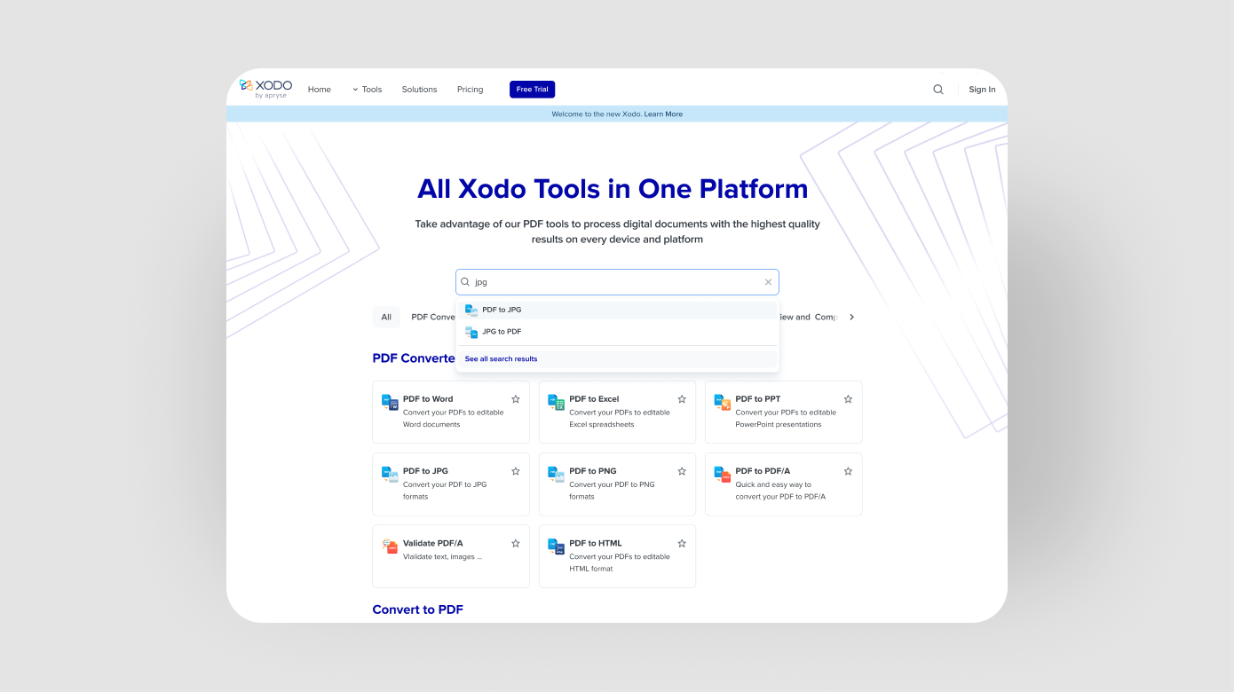
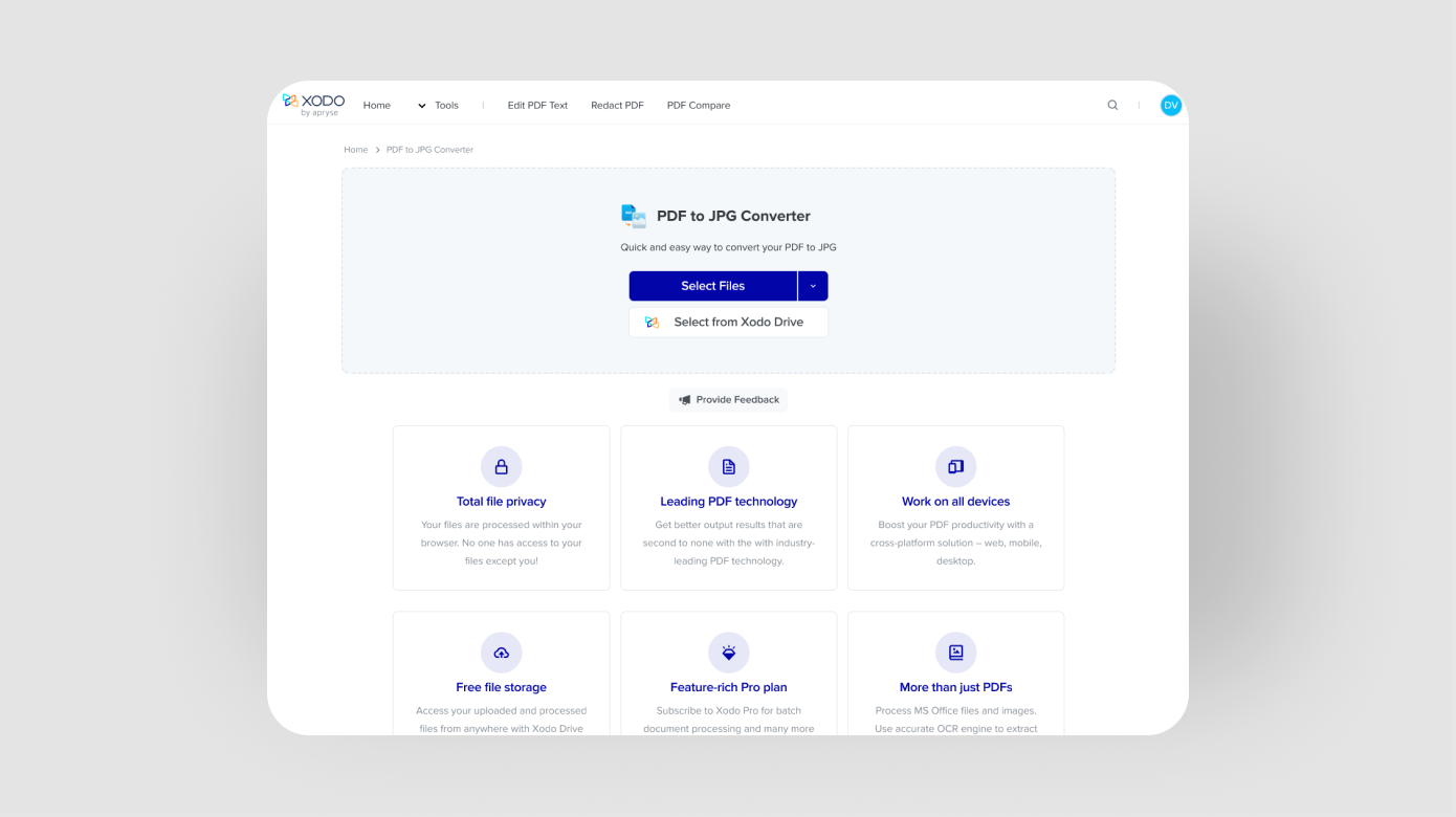
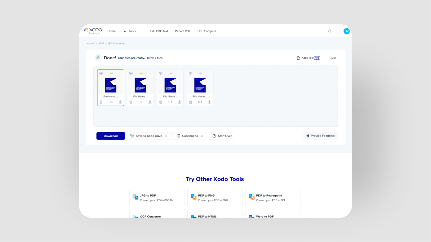
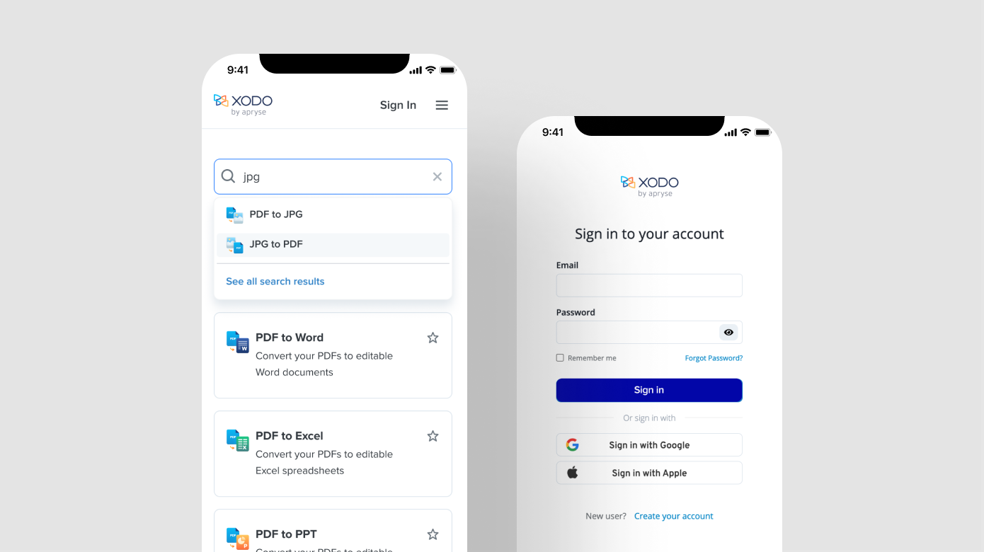
Modern Web-Based Application Experience

The redesigned homepage introduced several UX improvements:

  • A favoriting system to help users quickly access frequently used tools
  • Search functionality to surface tools faster and reduce navigation effort
  • A simplified layout that supports both free and premium (Xodo Pro) features
  • Visual alignment with Apryse’s new design language, using consistent components and interaction patterns

One unique challenge was determining how to differentiate free vs. Pro functionality without creating friction. This required close collaboration across marketing, product, and engineering teams to ensure upgrades were discoverable, but not disruptive.

Current Metrics (as of mid-2023):

  • 2M+ monthly active users
  • 500,000+ weekly web visitors
  • 20M+ mobile app downloads

Project Snippets

Journey Mapping
Xodo Homepage
Xodo Homepage Search
Xodo Action Landing
Xodo Action Complete
Xodo Responsive

All designs are shown for educational/fair use purposes only. Screenshots reflect public-facing features at the time of my contribution.